Liemburg and Niessen: A Joint Expedition

Photography Corriette Schoenaerts.
About the collaboration between Richard Niessen, Jennifer Tee & Harmen Liemburg.
Text Nadette de Visser for Amsterdam Index 2006 (A shortcut to creative Amsterdam).

Dowload Pdf of this article here:
Amsterdam Index 06
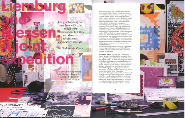
In the language of form that is graphic design, Harmen Liemburg en Richard Niessen have developed their own dictionary. This Amsterdam based duo, in collaboration, was previously known as Golden Masters. Meandering through styles, colors, texture and shape, Liemburg and Niessen create design that borders with and crosses over to art. It is a playful world this illustrious duo live in, one that curls and winds and consists of windows to different spaces and places.
It wasn’t long after they graduated from the Amsterdam based Rietveld Academy when two young designers met and muted. Liemburg: “I knew and liked Richard’s work. He is someone who experiments and improvises with very humble tools. He has a exploring mind and, like me, loved print and its process.” Niessen: “I remember Harmen’s graduation project. It was posters in three print editions with mixed colors. At that time, the end of the nineties, everyone either printed full color or monochrome, and all was computer design. To superimpose colored layers and have them create new color schemes was an adventurous thing.” Shortly after they met, they started sharing a studio, brainstormed, and became Golden Masters. The three years that followed were hectic, immensely inspiring and successful.
Not long after Liemburg and Niessen became a team, they were approached by artist Jennifer Tee with a special assignment. Liemburg: “We had our own projects going, one of the main things was organizing the ‘Jack’ events. Jack was a multi- discipline event, a stage where different disciplines could meet and cross. Writers, musicians, graphics designers, artists, industrial designers and architects, all came together and cross fertilized.” Jennifer Tee’s art project was right up their alley. Tee had been looking for graphic designers who could work with her as an integral part of her installations. Niessen: “It was a real challenge to us. Our work had to be part of the overall exhibit, a work within her work.”
Golden Masters and Jennifer Tee
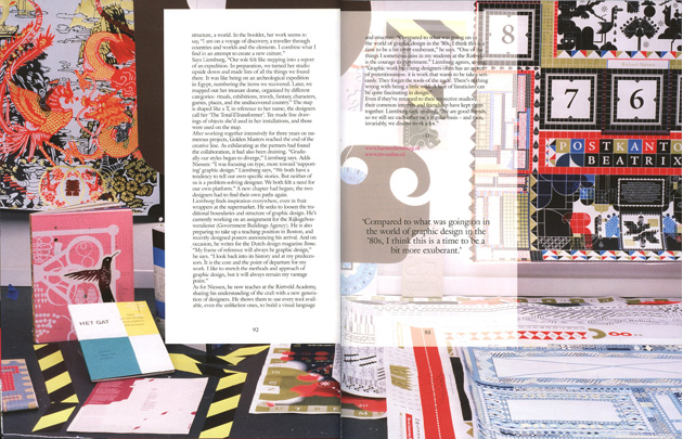
A small package folds out into a huge map that wavers out to the ‘Jennifer Tee universe’. Her work seems to say “I am on a discovery trip, a traveler through lands and worlds and the elements. What I find I assemble, in an attempt to create a new culture.” Liemburg: “Our role felt like stepping into a reportage of an expedition. In preparation, we turned her studio up side down and made lists of all the things we found there. It was like being on an archeological expedition in Egypt, numbering the items recovered. Later her treasure dome was mapped out by us. By rituals, exhibitions, travels, fantasy, characters, games, places and the undiscovered country.” The ground plan is shaped into a T, to refer to her name. ‘the Total-T-Transformer.’ Niessen: “Jennifer made line drawings of the objects she uses in her installations. In turn those were used in the map.”
The end of Golden Masters
After working together intensely for three years on numerous projects, the Golden Masters duo was at the end of their creative spur. As exhilarating as the collective had been to the partners, it was also quite draining. Liemburg: “Gradually our styles began to diverge. Niessen was more focused on architecture in the flat square.” Niessen: “I was focusing on Type, more toward the ‘supporting’ graphic design.” Liemburg: “We both have the tendency to tell our own specific story. But neither of us are problem solving designers. We both felt the need for our own platform.” A new chapter had started, where Liemburg and Niessen had to find their own way about design again.
After Golden Masters
Liemburg can still find inspiration anywhere, whether it is fruit wrappers at the grocery store or anything else he comes across. His design is inspired by the letting loose of the traditional boundaries of graphic design and its structure. At this point he is working on an assignment for the Rijksgebouwendienst, where architecture meets design. He is also in full preparation of a teaching position in Boston, and recently designed the posters announcing his arrival. On occasion, the ‘millipede designer’ writes about design for Items Magazine. Liemburg: “My frame of reference will always be graphic design. I look back into its history and at my predecessors. It is the core and the point of departure for my designs. I like to stretch the means and approach of graphic design, but it will always remain my vantage point.”
As for Niessen, he teaches at the Rietveld academy, sharing his craft with the new graphic generation. Niessen shows them to use all tools available, to the most unlikely ones, to build a visual language and structure. It is no coincidence he has been dubbed ‘typographic mason.’ Niessen: “Compared to what was going on in the world of graphic design in the eighties, I think this is the time to be a little more exuberant. One of the things I sometimes miss in my students at the Rietveld is the nerve to experiment.” Liemburg agrees: “The graphics by young designers often have an aspect of pretentiousness, it is work that wants to be taken serious. They forgot the tools of the trade. There is nothing wrong with being a little wild. A hint of fanaticism can be quite fascinating in design.” Even if the duo now has returned to their own creative desks, their common interests and friend kept them together. Liemburg (smiling): “We are good friends, so we still see each other on a regular base and then, invariably, we discuss work a lot.”
Text: Nadette de Visser
Photography and installation: Corriette Schoenaerts
Page layout: Vandejong
Published by: Bis Publishers
See also Golden Masters New Workspace