Karel Martens: Permutations

Text Harmen Liemburg
For Étapes design and visual culture, international edition #21, September 2010
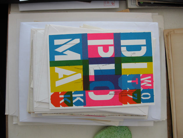
Karel Martens attended the Arnhem School of Art in the late 1950s, where he was trained as a fine artist. Once a week he received instruction in illustration and ‘publicity’ from a painter. The trade of graphic design as we know it today had yet to be invented. After graduation in 1961, Martens started to work for himself out of a small village, but this didn’t mean he was looking for isolation in his work. He establishes relationships with cultural and political clients like the Socialistiese Uitgeverij Nijmegen (SUN Publishers), a small idealistic publishing house for which he designed numerous bookcovers between 1975 and 1981. Influenced by the dominant current of the Swiss School, Martens develops an approach to design that is committed to clearity and economy. The art of reduction. Making the most of pre-Macintosh typesetting limitations and low budget offset printing tools, graphic systems develop by repeting forms or subtle shifts in colours. Abstraction and reservation predominate the work. Parallel to his commissioned work, Martens starts to use metal objects he finds on the street and Meccano parts that are printed on paper such as redundant cards that he saves from the local municipal archives’ wastecontainer. In this non-commisioned or ‘free’ work, he experiments with overprinted transparant colours that result in new and unexpected combinations. Brilliant fluorescent inks and aging yellowish paper amalgamate in elegant textures. Joyful childrens’ toys meet rigid administrator’s frames in serendipious beauty. While playing, Martens is developing a new set of sensibilities.

From small to large
In addition to his printwork for various publishers, Martens starts to work for what will be his largest client, the Dutch governement. Throughtout the ‘80s, ‘90s and well into the ‘00s, he is commissioned to make coins, postage stamps and other things. His brief from the Dutch PTT Telecom (now KPN) to create a standard, every day telephone card in seven different denominations (1994), causes him to put together his ever present fascination for numbers and awe for colour with a solution that will please both client and the general public. Each card features a pattern of overprinted numbers in different colours. They are based on a code where different combinations of numbers and colours represents a letter of the alfabet, that combined spell out the Dutch national anthem on the cards. The project is exemplary of the beautiful way Martens synchronises order and logic with an emotive sense of wonder for the surrounding world. The alphabet is another phenomenon that causes his ongoing fascination, something that is reflected in the very type oriented way he designs a multitude of books and bookcovers. By combining the printing industry’s standard solutions for the use of papers, inking systems, binding techniques and halftones, Martens utilizes these technical variables in such a way that they become an expressive part of his vocabulary. Some of his original inventions, like printing type on top of a Japanese bound book’s folds (1986), was adopted and applied sucessfully by various other designers. Later on, new commissions challenged him to translate his ideas to a larger scale, like Veenman Printers in Ede, where type becomes a in integral, three dimensional part of the building’s façade. In newer projects like the Philharmonic building in Haarlem, a musical score is translated into abstract graphic patterns printed on glass surfaces that leave space for the viewer’s own imagination. Recently, though generated by modern computersoftware and the latest industrial printing techniques, his colourful façade for the Cultuurstrip in Amstelveen reflects the delicate nature of his letterpress experiments. From the small and private to the large and public. And back again.

Teaching
Martens has taught graphic design since 1977. His first appointment was at the school of art in Arnhem (until 1994). He was then attached to the Jan van Eyck Academie in Maastricht (1994-99). From 1997 he has been a visiting lecturer in the graphic design department at the School of Art, Yale University. In 1998, together with Wigger Bierma, he started a pioneering school of postgraduate education within ArtEZ, Arnhem – the Werkplaats Typografie –, where he still teaches. WT, located in a former radio distribution center in Arnhem, was set up as a fully functioning studio, in which professors and students work on real commissions side by side. True to this vision, students were invited to help him design the architectural journal OASE. Within the framework of a fixed physical size, each issue’s appearances are generated by content, and thus is a platform for experimentation. In 2008, at the journal’s 25th anniversary, 75 issues had been made that all look completely different. In 2001, Martens assumes a less prominent role at WT and moves his home and studio to Amsterdam, though once a week he travels to Arnhem to discuss projects with his students.

Printed Matter
Martens’ development, working process and design ethics are documented in Printed Matter\Drukwerk, that was first published in 1996, when Martens received the A.H. Heineken Prize for Art for his entire oeuvre up to that moment. PM represents Martens’ work in a dense abundance of miniature reproductions, while sketches, unauthorized versions and letterpress experiments are depicted full-page. Chinese-bound, printed on uncoated paper and wrapped in brown, this modest yet multilayered book has it’s own tactile qualities. In 1998 the book, composed and designed together with Jaap van Triest, was chosen as the ‘most beautiful book in the world’ at the annual Leipzig Book Fair. A comical overstatement that hardly fits Martens’ own modest personality, but certainly one that acknowledges him as a master of the medium he dedicated his career to. First and second editions of Printed Matter sold out rapidly, used ones are very sought after on eBay and Amazon. I got my own cherished copy as a design student at the Gerrit Rietveld Academie in Amsterdam, where in 1998 Martens was counselling the graduation projects of our class. But before that, some of his public designs (specifically the 1994 phonecards series for PTT Telecom), inspired me to start my own screenprinting experiments. The colourful circular monoprints that are also printed on PM’s cover excited me in particular, and furhter triggered my interest to physically work with ink and paper myself. Although I’ve spurned my own opportunity to be a student at the WT, I’ve always been aware of his presence as tutor-at-a-distance.
– – –
Available publications:
Printed Matter\Drukwerk
Robin Kinross, Jaap van Triest, Karel Martens
Hyphen Press
First 1996 edition and Second 2001 edition: out of stock
Third 2010 extended (work updated up to 2010 + interview about education) edition: 2010.
Wonder Years, Werkplaats Typografie 1998 – 2008
Contributions by Stuart Bailey, Uta Eisenreich, Paul Elliman, Raimundas Malasauskas, Karel Martens, Armand Mevis, Radim Pesko, and Willem Oorebeek.
256 pp, illustrations in black and full colour
Roma Publications 2008
ISBN 9789077459300
30,- Euro
Graphic Magazine #9, 2009, Werkplaats Typografie Special
200 pp, illustrations in full colour, English, Korean
19,- Euro
Order through WT website
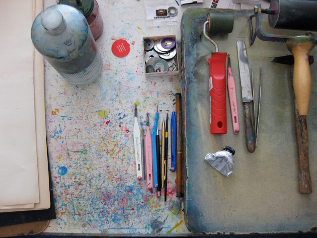
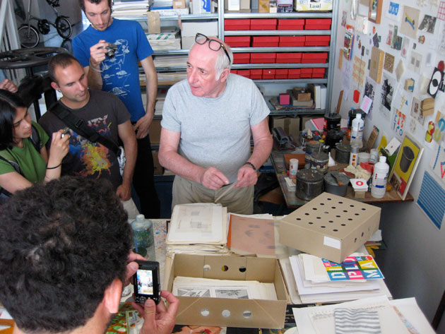
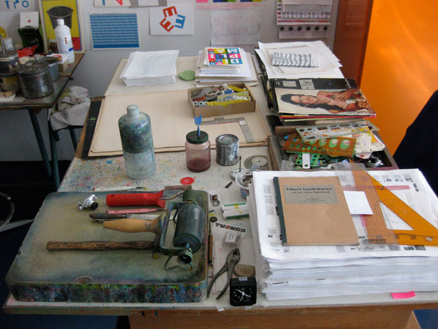
All photographs were taken during a studio visit with Jon Sueda and a group of California College of the Arts (CCA) graphic design students, July 2009