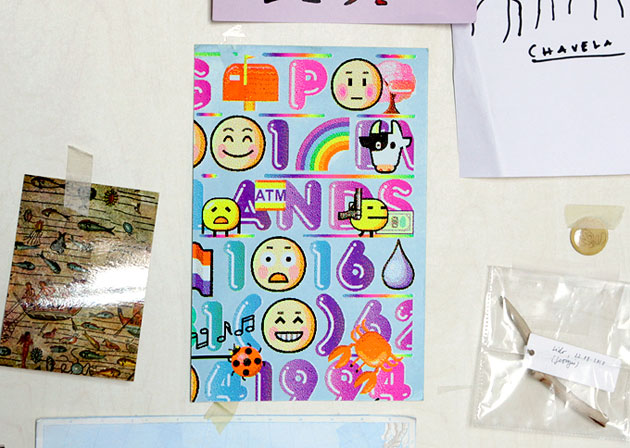
Emoji Correspondence Cards
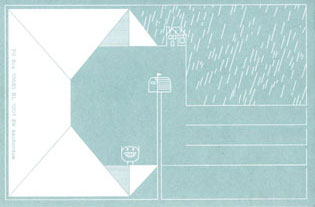
Emoji Correspondence Cards
2011
180 x 275 mm
Screenprint, 5 colour on heavy coloured cardstock, various cuts
Around 100
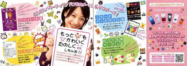
During my last visit to Japan, end of 2006, I was fascinated by the level of graphic detail in visual Japanese cellphone communication. We’re talking about emoji, Japlish for emoticons, or pictograms that express emotion. I’ve written a separate post (in Dutch) about this cultus.
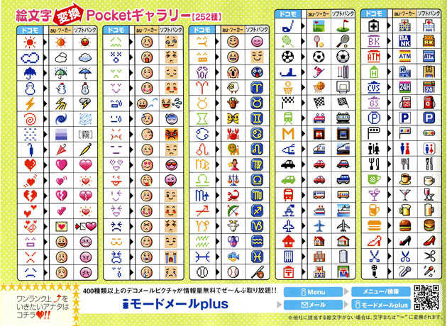
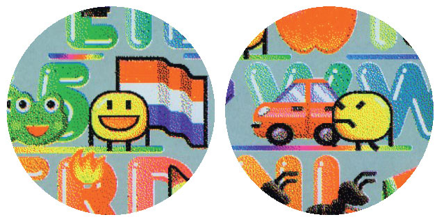
Different providers, different interpretations. The best one, Au is placed in the middle of each column.
My cellphone provider NDDI Au, offered the best designed emoji. Unfortunately my Japanese is too poor, so I never got to use them at the time…
Years after I got hold of the Illustrator version, which opened up the opportunity to use these images for printdesign.

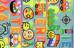
Enlarged it’s funny to see how rough the original designs actually are.
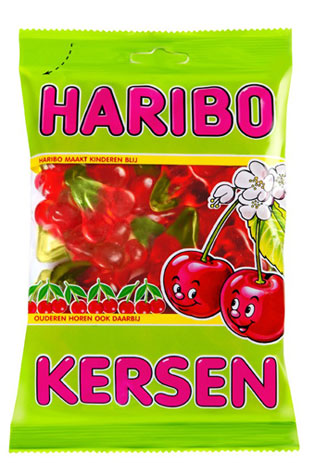
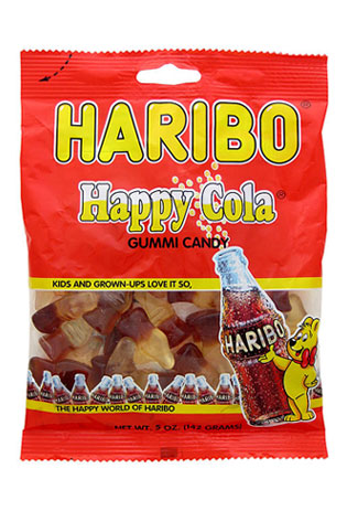
Searching for type to combine with the semi-three dimensional pictograms, didn’t take long: my favourite Haribo printshop-candy provides just the right gloss highlights, but not the right shapes. Too tall to match the circular shaped images.
I’ve always loved the classic Dunkin’ Donut logo. The logotype = the product!

The gloss and proportions of the Frankfurter Highlight font are in between Haribo and DD. Perfect.
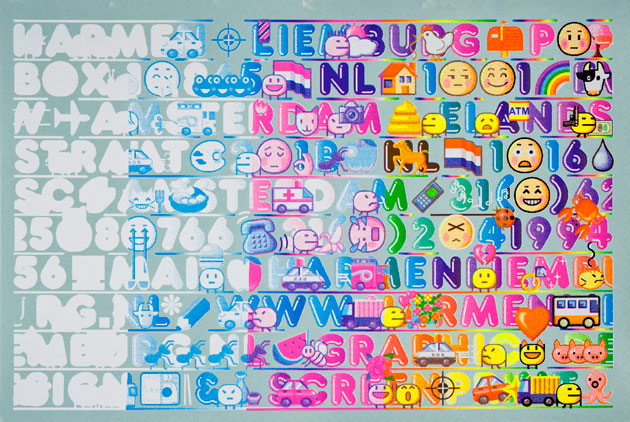
Uncut printing sheets 50 x 70 cm. Building up full color using fluo instead of CMY. Starting by blocking the blue base layer with a solid opaque white.
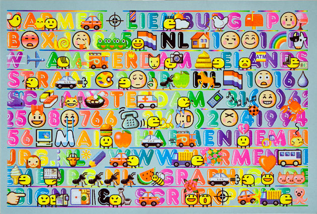
Done.
See also Japanse emoji dieper dan iPhone versie, article (in Dutch) originally for Items Magazine webversion #2/2011
