Aurora
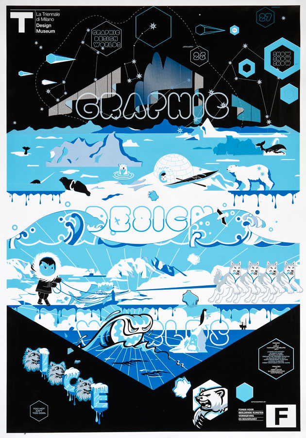
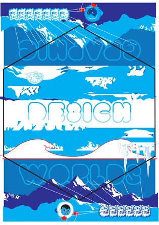
Aurora (Graphic Design Worlds – Print 5/5)
2011
H 1189 x W 841 mm
4 colour screenprint on 120 grams/m2 Natronkraft paper
20 signed and numbered prints out of 50 prints total
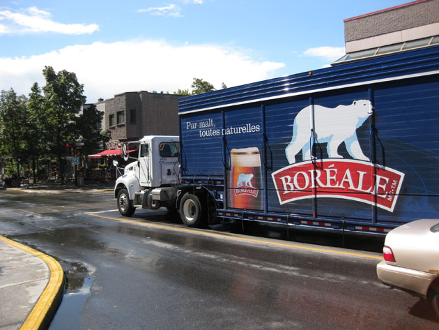
Walking around in Montreal, October 2010, I encountered this polar bear. It’s the logo of Boréale, a Canadian brewery who’s beer is not too undrinkable at all.
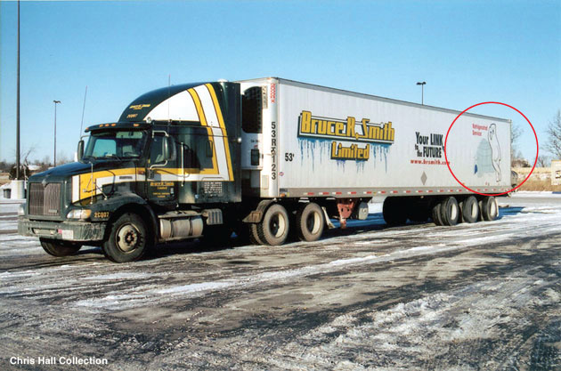
Photo courtesy Chris Hall
I’m not sure if you can see it right, but I’d love to get a better shot (kind of hard if you’re behind the wheel yourself) of this Bruce R. Smith Ltd. truck with the really cute polar bear leaning onto an igloo.
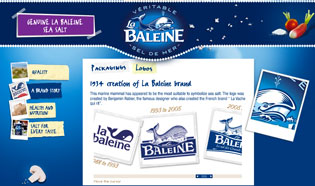
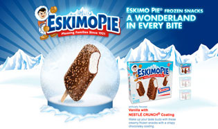
La Baleine, the French brand of table-seasalt, changed it’s logo again. (To be discussed in a different post.) Seen through modern eyes, Eskimo Pie is probably one of the most racist (I guess ‘Inuit Icecream’ doesn’t sound too funky) brands around. The history of it’s super cute advertising art is noticeable, although never documented thoroughly as far as I know.
Apparently, I’m slightly obsessed with snow and ice…

These labels were found in The World of Can Labels, a publication I found in a Tokyo bookstore end of 2007.
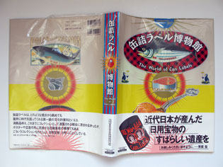

The 2331 can labels included in this book were selected from collections of the Japan Canners Association and various canning companies.
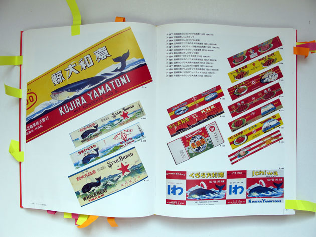
They were made from the Meiji (1868-1912) to the Showa periods (1926-1989), but the largest number was in use from the Taisho period (1912-1926).

As approximately half of the canned products made in Japan during this period were exported, many of the labels are printed in foreign languages, like English or French.

Anyway, this fonts by by Somewhere Else (what’s in a name), with its marshmellow-, neonsignish soft rounded shapes, gave the whole thing some structure, and got things going…
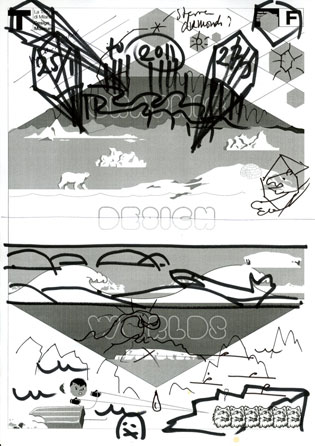

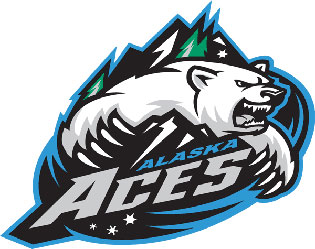
Spicing up the design with some agression: logos courtesy West Michigan Whitecaps (baseball) and Alaska Aces (ice hockey).
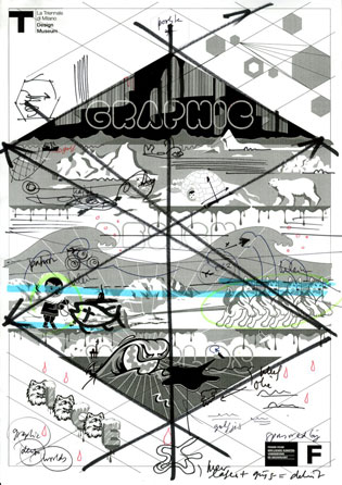
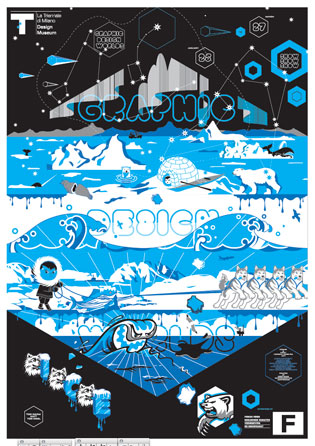
Typically one of those projects where I did’t know how to stop, and completey lost track of things…
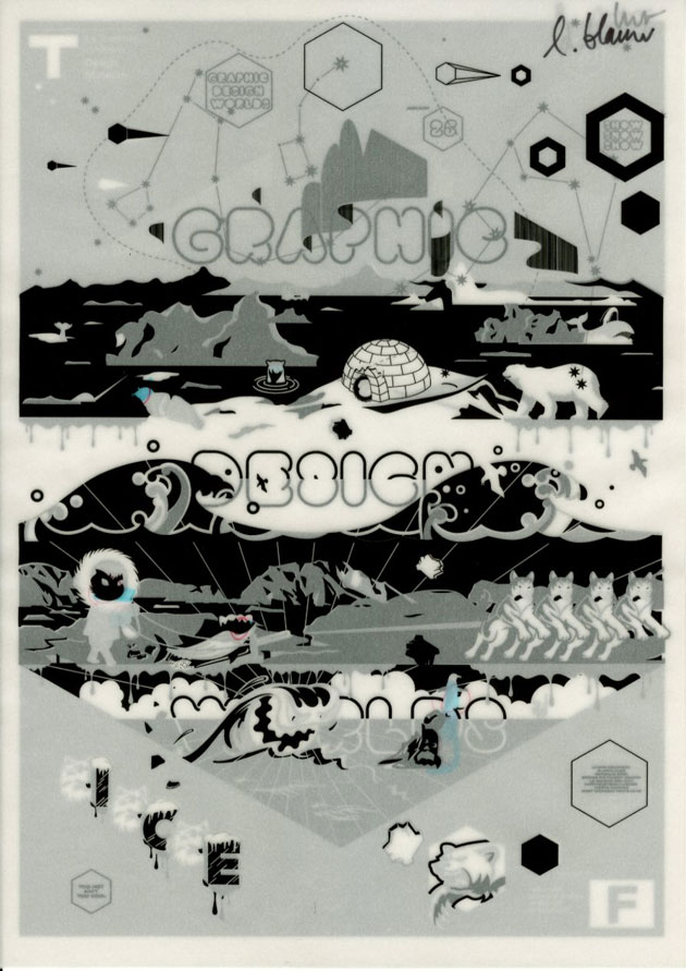
Four colour separations: black, darker blue, opaque white, white + cyan, and some repairwork.