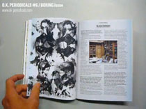
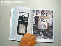
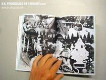
The Boring Issue Interview


For #6 – The Boring Issue, O.K. Periodicals asked me about the 2008 project in the Smith-Lesouëf library (France).
Interview through email by Marlies Peeters
First off, could you tell us a little bit more about this “Black Current” project? How did you end up at the Smith-Lesoëf library in the first place?
Every fall, Maison d’art Bernard Anthonioz invites somebody involved in a previous edition of the International Poster and Graphic Design Festival of Chaumont. The connection was made through Etienne Bernard, the curator who helped me to excute my installation at Chaumont’s 2005 festival. The Bernard Anthonioz gallery is located in Nogent sur Marne, once a noblemens’ countryhouse, and now a green enclave in one of Paris’ suburbs. The main building is an elderly home for retired artists, with a park and the gallery attached to it. During my first visit I was given a tour around the premise, and this is how I first saw that library. Since it was in a complete state of chaos with no librarian or custodian to breathe down on my neck in sight, I simply recognised the opportunity to work there.
Being stuck in a stuffy room filled with old books would be considered pretty boring by some. Were you ever bored? Wouldn’t your brain simply get satiated at some point after seeing so many images?
Mmm, since there was no system and hardly any order, I had to browse through all the works present a few times. First to get a sense of the potential. Second to get a better sense of what was located where, and third, to filter out all materials I intended to use.
I was never bored because my time there was limited, and I had a lot of work to do. But it was a dirty job though. Nobody had taken off dust there in at least fifty years, so you can imagine everything was covered in smelly black sooth. I had to wear a mask and get fresh air regularly. Unfortunately there was a lot of junk too, ugly books or publications without any visual elements that were of interest or use to me. Besides books, there were personal souvenirs from previous residents. Nothing that I could use really, but very interesting to unpack.
And satiation? Of course. But occasionally, I like to focus completely and immerse myself in this type of material, meanwhile thinking of a potential use. I know there’s a world of fantastic material out there in libraries all over this city, nation, world, that I would love to get my hands on. But finding it, getting acces to the material, and most important to me, being allowed to make the right type of reproductions made in a reasonable time at a decent price is very tough.
In the posters, you mix up the old wood engravings found in the books with more contemporary visuals from your own archives. There’s an interesting dynamic in the materials that inspire you on the overall. On the one hand there’s the old and meticulously made, on the other modern-day candy wrappers and other types of commercial packaging. How do you unify these interests that are seemingly worlds apart?
The keyword for what I was looking for is serendipity, the abillity to recognise quality in something created by chance. You’ll just know the moment when elements from completely different worlds find each other and connect… when you’re doing it. This can partly be simulated on the computer, but since I was working with tactile materials, not entirely. You should not forget that at the basis of all my previous work ( of which I reused the colour separations) there’s a certain value because of previous decisions about composition, detail etc. And my personal taste in graphics of course. So far, I’ve learned to trust my own process. If the ingredients are of good quality, whatever comes out of it (enough time, work and reconsiderations provided) should be af good quality too.
What turned out really well was the overprinting of the woodengravings (which are basically handcut line halftones) with solid images printed in layers of white ink inbetween. Unbelievable greytones, amazing textures. But, I think out of roughly 250 printed combinations that were all different, maybe 20 % was really good. All in all, it’s a very labour intensive process, a full month of non-stop printing, judging, selecting and printing again.
Almost everything you make is screen printed, a lengthy, time-intensive process which you could have done by someone else if you wanted to. How come you never tire of this technique?
Well, does a cyclist ever get tired of his bicycle, or a photographer of his camera? I’ve had plenty of moments of doubt of course, especially when I’m tired or when things go wrong. I don’t necessarily HAVE to screenprint everything, but after 12 years, I’m still very enthousiastic about this versatile and powerful technique. Most people don’t realise that today, screenprinting is a widely used industrial technique. From the lines that defrost your car’s rear window to your hockeystick, t-shirt, skateboard, beer bottle, skin lotion pot, to the type on your coffeemachine, it’s all screenprinting. The basic principles are very simple, but making the most of the tools that are available to you as a DIY printing designer/artist/illustrator (typically second hand equipment) requires patience, discipline, practise and, after a while, experience and skill. Not easy, as my students at the Rietveld academie -or wherever I go- will acknowledge. Working on my own in the screenprinting studio, listening to music, being engrossed by the work at hand, doing the same things over and over again, has a meditative component. I can’t help loving it. Especially in this digital age, there’s great satisfaction in creating something physical you can actually touch and smell, and (assuming you didn’t stop after one print) share it with the world!